6 habit-forming UX features to use in your healthcare app
Quality user experience (UX) design is essential to the recruitment and retention of smartphone app users, yet consumer apps are frequently lightyears ahead of traditional healthcare companies’ tech solutions (as evidenced, for example, by the number of EHRs that don’t meet usability testing standards). The idea of “consumer-grade UX,” (a term usually used when referring to enterprise apps) is nothing new, but unlike enterprise apps’ users, healthcare app consumers have a choice of whether to use your product or a publicly available alternative. When it comes to smartphone apps, your competition is in fact the entire app store.
In order to see significant uptake and usage, it’s essential to take your cues from consumer applications. Not sure where to start? Here, we’ve rounded up our six favorite UX features designed to help form habits.
1. Use color to create clarity
Wonderful day focuses on helping users develop habits by showing them how long they’ve maintained a streak. They create focus and clarity by using red and green in a simple interface to help the user see exactly how they’re doing. Such an interface could be used in a healthcare context for tracking medication adherence, for example.
2. Keep things on a need-to-know basis
Care protocols can be extremely overwhelming, and research has shown that patients frequently do not understand discharge instructions. For example, in one study 27% of patients didn’t understand their medication recommendations and only 50% understood dietary recommendations. Consumer apps like Habit List focus just on what you need to do today, making the steps in a healthy lifestyle change more accessible.
3. Use the magic words
Many elements in a care protocol can be handled in a simple “yes” or “no” format. Rather than making the format more complex, try taking a page from Way of Life and ask your patient a simple, straightforward question in layman’s terms. For example, “Did you exercise today? Yes or No.”
4. Remind people what to do, right when they need to do it
Life’s busy! As anyone who’s tried to create a new habit can attest, it’s tough to remember to take action when you haven’t yet developed a cue to rely on. Until the behavior becomes ingrained in the user’s day-to-day habits, your app can be that cue. You can use push notifications that factor in time, frequency, and even location, like Any.do.
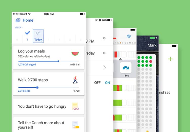
5. Offer visual positive reinforcement
Your interface should reward the behavior you want to form, down to even the most basic visual elements. For example, at Noom we show a checkmark at the top of each day’s tasks. Until the user completes all of their tasks, including logging their meals, that checkmark remains only an outline. Then when their tasks are complete, they get a satisfyingly filled in checkmark affirming that they’ve done everything they need to for the day.
6. Visualize progress
You could simply tell your users how they’re doing and what to do next or you can show them. Research has shown that self-efficacy is a predictor of more effective behavior change. Use data analysis in the form of charts and graphs, like Optimized, to show users how they’ve done over time. Then let them see how that’s impacted their progress and draw their own conclusions on what to do next.
The key to leveraging effective UX, of course, is not merely mimicking what works for others, but understanding at a human level what your patients need to do to achieve their goals, and how they can be encouraged to take those actions — whether that means simplifying the next steps, making data entry more intuitive, or adding delightful interactions to make the mundane motivating.
