The effect of UX on scalability
The leading in-person and telephonic coaching platforms allow health coaches to provide up to 50 participants with a high-touch, quality experience; or they can deliver simple, standardized interventions to as many as 175. There is significant evidence that coaching improves protocol adherence, but in the existing ecosystem, you can have high-touch coaching or scale, but not both.
For coach-supported behavior change programs to scale, each coach needs to be able to monitor, motivate, and guide far more patients. We believe this step change in scalability is only possible if usability research becomes far more central in the design of platforms that support coaches, clinicians, and caretakers.
Usability research in the healthcare industry
Usability research, or user experience testing, (the process of understanding how end-users interact with a product by watching them use it) is a key component in modern product design, but is often overlooked in the development of healthcare software. As the National Institute of Standards and Technology notes:
“Usability represents an important yet often overlooked factor impacting the adoption and meaningful use of electronic health record (EHR) systems. Without usable systems, doctors, medical technicians, nurses, administrative staff, consumers, and other users cannot gain the potential benefits of features and functions of EHR systems.”
We would argue that this shortcoming in the world of EHR design extends well beyond health records. And as one study points out, flaws in healthcare product design can lead to potentially dangerous medical errors. As another paper succinctly points out, the systems we build don’t just need to engage patients — they need to fit into the busy and often complicated workflow of healthcare professionals.
If your business relies on care coordinators, nurses, physicians, or caretakers interacting with a digital interface, usability testing needs to be part of your process. One of the key tools we leverage to deliver high-quality scalable coaching is our coach dashboard, and usability testing plays an essential role in increasing efficiency while optimizing for outcomes. Here, we detail how we used UX research to redesign our coach dashboard.
1. End-user interviews
Noom’s usability testing team has extensive experience interviewing our apps’ end-users to understand what they look for in a mobile health solution. In this case, the end-user was our own team of lifestyle coaches. Despite the temptation to assume we understood how our coaches would use the tools, our usability team sat down with individual coaches to discuss their processes — what they did every day, what was hard for them, what they felt they needed.
Often, the practice of interviewing is discounted in the UX world. After all, the mantra is “users don’t know what they want.” But this wasn’t about gathering a list of features and building them. The interviews focused on understanding how our coaches perceived their own role in the participants’ behavior change process, what things felt hardest and easiest to them, and how they spent their time. For example, we discovered simple things, like how our coaches think about their users’ behaviors, that would shape our later designs. Our researchers also gathered coaches’ perceptions, which they were able to test and validate during their later observations.
The takeaway: Don’t assume you know how your end-users work — even if you work together and sit next to them every day.
2. User ethnographies & usability sessions
Once our UX team understood the coaches’ responsibilities and overall role, they completed full-day ethnographies with individual members of the coaching team. They shadowed coaches as they went through their day-to-day work, noting which tools were used regularly, and what purpose they served. They paid attention to the time coaches spent on the phone and in the coaching dashboard. And finally, they tracked which dashboard features were used most.
Next, our UX team sat down with coaches for deeper dives into individual dashboard features. They watched how the coaches used them, with an eye toward inefficiencies, interface design flaws, and unused features. We quickly discovered that there are some different user personas among our coaches, and that they often used the same tools in different ways. We also found that coaches were relying on a slew of different sources to understand how a user was doing and what they needed to discuss with them. For example, in addition to the user profile in the dashboard, coaches were referencing a separate internal tool to get an overview of users’ food and weight logging.
The takeaway: Don’t just watch users interact with individual features; understand how those features fit into their overall workflow. You may be surprised what else they’re using to supplement your product.
3. Prototyping
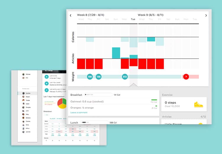
After a detailed analysis of all of their observations, Noom’s product, design, and UX teams began working on prototypes. The feature that was identified as highest priority for redesign was the user overview page (which allows coaches to dive deeper into users’ history).
As each new prototype was produced, a coach would complete a usability test. Here are just a few of the things we learn:
- Coaches didn’t want to see a whole month at a glance — they focused with users more on the past week or two.
- They also wanted to see exercise totals broken down by day, not week, so they could congratulate users for exercising five more minutes yesterday than the day before.
- Coaches didn’t just want an alert if the user gained weight; they needed to see every weigh in that had been completed.
- Colors have a huge impact on coaches perception. For example, the use of red implies an urgent and negative issue, and shouldn’t be used in other contexts.
Individually, each observation seems trivial, but as a whole they had an enormous impact on the usability of the user profile. Moreover, regular prototype testing ensured that no effort would be wasted building a flawed solution.
After extensive testing, the redesign moved into development, and improvements have been rolled out over the past week. So far, we already have one success story: One of our coaches was working with a user who achieved a huge weight loss success one week. Thanks to the new analysis and display of information, the dashboard showed that the participant had been celebrating that success and consistently logging over her budget the next few days. The coach was able to intervene and help the user get back on track — a reaction that would have been impossible before the redesign.
The takeaway: Design elements that seem minor can snowball and have a huge impact. Don’t discount the importance of frequent and iterative prototype testing.
The results
As a result of this redesign, coaches are better able to optimize their interventions. As Noom’s Behavioral Health Program Manager, Meghan, explained, coaches are able to pick up on trends in behavior more quickly, managing both who they should spend their time on, and which behaviors to focus on first. Moreover, coaches are able to pick up on disengagement from the program more quickly, as well as note which pieces of the curriculum users aren’t participating in.
While it’s tempting to skip a rigorous usability testing process when developing internal tools, it’s essential to be diligent. By following this process, we’ve been able to actually reduce the amount of developer effort spent (as no time was spent on unnecessary features), while significantly improving coach scalability. We found that coaches have been able to double their caseload without negatively impacting coaching quality.
